Building a website is one of the most rewarding starting points in software development. Every site you visit—from a simple personal portfolio to an online banking dashboard—relies on core technologies that structure content and control how it looks on screen.
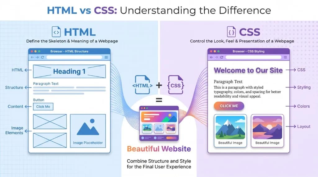
Two of the most important technologies in frontend development are HTML (HyperText Markup Language) and CSS (Cascading Style Sheets).
HTML defines the structure and meaning of webpage content, while CSS controls its visual appearance and layout. Together, they form the bedrock of the modern web. Whether you plan to become a frontend engineer, launch your first portfolio, prepare for technical interviews, or move on to frameworks like React and Next.js, mastering HTML and CSS is an essential first step.
In this guide, you will learn how HTML and CSS work together, explore clean code examples, understand semantic markup, master the CSS Box Model, Flexbox, and Grid, and discover a practical roadmap for building responsive websites from scratch.
Your HTML & CSS Learning Roadmap
Follow this structured path to build real webpages confidently without getting lost in framework complexity too early:
HTML Document & Tags
Semantic HTML & Forms
CSS Selectors & Box Model
Flexbox & Grid Layouts
Responsive Web Design
1. What Are HTML and CSS?
HTML and CSS are two distinct languages that work side by side in the browser, each owning a clear responsibility.
What Is HTML?
HTML (HyperText Markup Language) is the standard markup language used to structure content on the web. It tells the browser what every piece of content represents:
- Headings establish document titles and section hierarchies.
- Paragraphs organize blocks of readable text.
- Images embed visual media with accessible descriptions.
- Links connect users across pages and external resources.
- Lists group related items or ordered steps.
- Forms collect structured input from users.
Here is a minimal HTML document:
<!DOCTYPE html>
<html lang="en">
  <head>
    <title>My First Website</title>
  </head>
  <body>
    <h1>Welcome to My Website</h1>
    <p>This is my first webpage.</p>
    <a href="https://example.com">Visit Example</a>
  </body>
</html>
When a browser loads this file, it parses the HTML elements and renders them onto the page. Note that HTML is a markup language, not a general-purpose programming language—it describes document structure and meaning rather than executing logic or loops.
What Is CSS?
CSS (Cascading Style Sheets) is a stylesheet language that controls how HTML elements look and behave visually inside the browser. With CSS, developers customize:
- Text colors, fonts, and typographic hierarchy.
- Background colors, gradients, and images.
- Element dimensions, borders, padding, and margins.
- Page layouts, grids, and element alignment.
- Responsive behavior across mobile, tablet, and desktop viewports.
- Smooth transitions, hover states, and animations.
For example:
h1 {
  color: blue;
  font-size: 36px;
}

p {
  color: #444444;
  font-size: 18px;
}
Without CSS, browsers render HTML using plain built-in defaults (Times-style serif text, blue underlined links, and stacked blocks). CSS transforms that raw structure into a polished, cohesive interface.
2. Understanding How HTML and CSS Work Together
Modern websites require both HTML and CSS working in harmony, yet keeping their concerns separate.
Think of building a house:
- HTML is the architectural frame—the foundation, walls, rooms, doors, and windows.
- CSS is the visual design—the paint colors, furniture arrangement, lighting, proportions, and finishes.
Consider this HTML markup for a feature card:
<div class="card">
  <h2>Learn Web Development</h2>
  <p>Start building websites with HTML and CSS.</p>
  <button>Start Learning</button>
</div>
Now attach CSS rules to style that structure:
.card {
  background-color: #f4f4f4;
  padding: 25px;
  border-radius: 12px;
  max-width: 350px;
}

.card h2 {
  color: #222222;
}

.card button {
  background-color: #2563eb;
  color: #ffffff;
  padding: 10px 20px;
  border: none;
  border-radius: 6px;
  cursor: pointer;
}
HTML defines what exists inside the card; CSS controls how the card looks. Separating structure from presentation makes websites dramatically easier to maintain, redesign, and scale.
3. HTML Fundamentals Every Beginner Should Know
Before diving into JavaScript frameworks, make sure you are comfortable with core HTML document anatomy, tags, semantic elements, and forms.
3.1 Basic HTML Document Structure
Every standard HTML5 page follows a clean boilerplate structure:
<!DOCTYPE html>
<html lang="en">
  <head>
    <meta charset="UTF-8" />
    <meta name="viewport" content="width=device-width, initial-scale=1.0" />
    <title>My First Webpage</title>
  </head>
  <body>
    <h1>Hello, World!</h1>
    <p>Welcome to HTML development.</p>
  </body>
</html>
Each part plays a specific role:
| Element | Purpose |
|---|---|
<!DOCTYPE html> | Declares that the document uses modern HTML5 standards |
<html> | Root container wrapping the entire webpage |
<head> | Holds metadata, page title, and linked stylesheets or scripts |
<meta charset="UTF-8"> | Sets character encoding so symbols and international text display properly |
<meta name="viewport"> | Ensures mobile browsers scale the layout to the device width |
<title> | Sets the text shown in the browser tab and search results |
<body> | Contains all visible webpage content rendered to the user |
3.2 HTML Elements, Tags, and Attributes
HTML documents are built from elements, usually written with an opening tag, inner content, and a closing tag:
<p>This is a paragraph.</p><p>is the opening tag.This is a paragraph.is the content.</p>is the closing tag.
Attributes live inside the opening tag and provide extra configuration or metadata for that element:
<a href="https://example.com">Visit Website</a>

<img src="profile.jpg" alt="Developer headshot" width="200" />
In these examples, href, src, alt, and width are attributes.
Some elements are void elements, meaning they contain no inner text and do not use closing tags:
<img src="image.jpg" alt="Example visual" />
<br />
<hr />
<input type="text" placeholder="Enter your name" />
3.3 Common HTML Elements
Familiarize yourself with these everyday building blocks:
| Element | Purpose | Example |
|---|---|---|
<h1> to <h6> | Section headings | <h1>Title</h1> |
<p> | Text paragraphs | <p>Hello</p> |
<a> | Hyperlinks | <a href="/">Home</a> |
<img> | Embedded images | <img src="photo.jpg" alt="Photo"> |
<ul> | Unordered (bulleted) lists | <ul><li>Item</li></ul> |
<ol> | Ordered (numbered) lists | <ol><li>Step</li></ol> |
<li> | Individual list items | <li>HTML</li> |
<div> | Generic block-level container | <div>Content</div> |
<span> | Generic inline container | <span>Text</span> |
<button> | Clickable button | <button>Submit</button> |
<form> | Interactive user input form | <form>...</form> |
<input> | Form input field | <input type="email"> |
Here is a practical unordered list example:
<h2>Technologies to Learn</h2>
<ul>
  <li>HTML</li>
  <li>CSS</li>
  <li>JavaScript</li>
  <li>React</li>
</ul><h1> through <h6>) based on document outline and logical hierarchy—not because you want bigger or smaller text. Use only one <h1> for the main page title, nest <h2> and <h3> cleanly underneath, and control font sizes with CSS.3.4 Semantic HTML
Semantic HTML means choosing tags that accurately describe the meaning and role of their content rather than wrapping everything in generic <div> tags.
Core semantic landmarks include:
<header>for introductory banners, logos, or top-level page headers.<nav>for primary navigation menus and link groups.<main>for the central, unique content of the page.<section>for thematic groupings of related content.<article>for self-contained content such as blog posts or news cards.<aside>for sidebars, callouts, or supplementary links.<footer>for copyright notices, footer links, and site metadata.
Example semantic page layout:
<body>
  <header>
    <h1>Tech Learning Hub</h1>
    <nav>
      <a href="/">Home</a>
      <a href="/courses">Courses</a>
    </nav>
  </header>

  <main>
    <article>
      <h2>Introduction to HTML</h2>
      <p>Learn the foundations of web development.</p>
    </article>
  </main>

  <footer>
    <p>© 2026 Tech Learning Hub. All rights reserved.</p>
  </footer>
</body>
Semantic HTML strengthens accessibility (screen readers rely on landmarks like <nav> and <main> to jump between sections) and improves SEO, helping search engines interpret page structure accurately. Always pair semantic elements with meaningful alt text on informative images and explicit <label> elements on form inputs.
3.5 HTML Forms and User Input
Forms enable websites to collect structured data for registrations, logins, contact pages, search bars, and checkout flows:
<form action="/register" method="POST">
  <label for="username">Username:</label>
  <input type="text" id="username" name="username" required />

  <label for="email">Email:</label>
  <input type="email" id="email" name="email" required />

  <button type="submit">Register</button>
</form>
HTML provides specialized input types—such as text, email, password, number, date, and checkbox—along with built-in validation attributes like required, min, max, and pattern.
4. CSS Fundamentals Every Beginner Should Understand
Once your HTML structure is solid, CSS lets you control typography, color palettes, spacing, and responsive multi-column layouts.
4.1 CSS Syntax and Selectors
Every CSS rule consists of a selector (which elements to target) and a declaration block (the property-value pairs to apply):
p {
  color: #1e293b;
  font-size: 16px;
}
Essential CSS selectors include:
| Selector Type | Example | Description |
|---|---|---|
| Element | p | Targets all <p> elements on the page |
| Class | .card | Targets every element with class="card" |
| ID | #header | Targets the unique element with id="header" |
| Universal | * | Targets every element in the document |
| Group | h1, h2 | Applies the same declarations to multiple selectors |
| Descendant | .card p | Targets <p> elements nested inside .card |
Example HTML and matching CSS:
<h1 class="title">Welcome</h1>
<p id="description">Learn CSS fundamentals.</p>.title {
color: darkblue;
}
#description {
font-size: 18px;
}Classes are the workhorse of scalable CSS because you can apply the same class across any number of reusable components.
4.2 Understanding the CSS Box Model
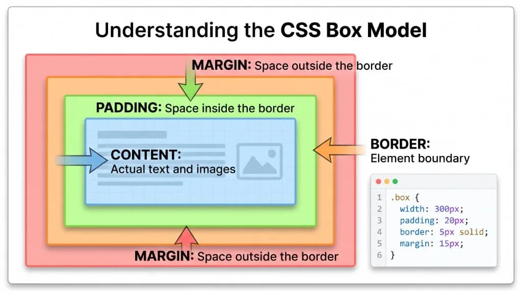
The CSS Box Model explains how browsers calculate the size and spacing of every element. Every HTML element renders as a rectangular box made up of four concentric layers:
- Content: The text, image, or nested elements inside the box.
- Padding: Transparent breathing room between the content and the border.
- Border: The visible line framing the padding and content.
- Margin: Transparent outer spacing separating this element from neighboring elements.
Consider this CSS rule:
.box {
  width: 300px;
  padding: 20px;
  border: 5px solid black;
  margin: 15px;
}
Under CSS’s default content-box sizing model, width: 300px applies only to the inner content area. The total horizontal space the element occupies becomes:
300px (content) + 40px (20px left + 20px right padding) + 10px (5px left + 5px right border) + 30px (15px left + 15px right margin) = 380px
To keep sizing intuitive, modern stylesheets almost universally enable border-box:
*,
*::before,
*::after {
  box-sizing: border-box;
}box-sizing: border-box, a declared width: 300px includes the content, padding, and border combined—so adding padding no longer breaks your grid or causes unexpected horizontal overflow.4.3 CSS Colors, Typography, and Spacing
Here are clean examples of core visual properties:
body {
  background-color: #f5f5f5;
  color: #222222;
}

h1 {
  font-family: system-ui, -apple-system, sans-serif;
  font-size: 32px;
  font-weight: 700;
  line-height: 1.3;
}

.card {
  padding: 20px;
  margin: 15px;
}
CSS supports both absolute and relative measurement units:
| Unit | Meaning | Common Usage |
|---|---|---|
px | Pixels | Crisp borders, icons, and exact fixed offsets |
% | Percentage | Widths relative to the parent container |
em | Relative to parent/element font size | Component-scoped padding or spacing |
rem | Relative to root (<html>) font size | Consistent typography and spacing scales |
vw | Percentage of viewport width | Fluid hero sections and responsive headings |
vh | Percentage of viewport height | Full-screen sections (100vh or 100dvh) |
Modern responsive designs generally combine rem for typography and spacing with % and vw for fluid containers.
4.4 Flexbox and CSS Grid
Flexbox and CSS Grid are the two foundational layout engines in modern CSS.
CSS Flexbox
Flexbox excels at one-dimensional layouts—aligning and distributing items along a single row or column:
.container {
  display: flex;
  justify-content: center;
  align-items: center;
  gap: 20px;
}
Key Flexbox properties to learn early include display: flex, flex-direction, justify-content, align-items, flex-wrap, and gap. Flexbox is ideal for navigation bars, button rows, toolbars, and centering items vertically or horizontally.
CSS Grid
CSS Grid is built for two-dimensional layouts where you control rows and columns simultaneously:
.grid-container {
  display: grid;
  grid-template-columns: repeat(3, 1fr);
  gap: 20px;
}
This snippet creates three equal-width columns (1fr each) separated by a 20px gap.
| Feature | Flexbox | CSS Grid |
|---|---|---|
| Dimensionality | One-dimensional (row or column) | Two-dimensional (rows and columns) |
| Strength | Aligning items and distributing space inside components | Structuring overall page layouts and card grids |
| Typical example | Navigation bar, button group, badge row | Dashboard layout, responsive card gallery |
Neither replaces the other—experienced frontend engineers routinely use CSS Grid for outer page sections and Flexbox inside individual components.
5. Responsive Web Design: Making Websites Work on Every Device
Today’s websites must adapt smoothly across large monitors, laptops, tablets, and smartphones. Responsive web design ensures layouts reorganize gracefully instead of overflowing or forcing users to pinch-zoom.
Understanding CSS Media Queries
Media queries apply CSS rules conditionally based on viewport width or device capabilities:
.container {
  display: grid;
  grid-template-columns: repeat(3, 1fr);
  gap: 20px;
}

@media (max-width: 768px) {
  .container {
    grid-template-columns: 1fr;
  }
}
On wider screens, .container renders three columns; when the viewport narrows to 768px or less, it automatically stacks into a single readable column.
Important Responsive Design Techniques
- Prefer fluid widths (
max-width: 100%, percentages,frunits) over rigid pixel container widths. - Add media-query breakpoints where your layout actually starts to feel cramped.
- Keep images responsive (
img { max-width: 100%; height: auto; }) so visuals never overflow mobile screens. - Eliminate unintended horizontal scrollbars.
- Adopt a mobile-first workflow—write base styles for narrow mobile screens first, then layer
@media (min-width: ...)rules for tablets and desktops. - Test across multiple viewport presets using browser DevTools.
6. How to Connect HTML and CSS
There are three ways to attach CSS styles to an HTML page.
Method 1: Inline CSS
Styles are placed directly inside an HTML element’s style attribute:
<h1 style="color: red;">Welcome</h1>While convenient for quick prototypes or HTML email templates, inline CSS mixes content with styling and becomes difficult to maintain in real websites.
Method 2: Internal CSS
Styles sit inside a <style> tag within the document’s <head>:
<head>
  <style>
    h1 {
      color: blue;
    }
  </style>
</head>
Internal CSS works well for tiny single-file demos, though styles cannot be shared across multiple pages.
Method 3: External CSS
Styles live in a dedicated .css file linked via <link> inside <head>:
<!-- index.html -->
<head>
  <link rel="stylesheet" href="style.css" />
</head>/* style.css */
h1 {
color: green;
}External stylesheets are the industry standard because they separate concerns cleanly, allow browsers to cache CSS across pages, and keep multi-page projects organized.
7. Common HTML and CSS Mistakes Beginners Should Avoid
Avoiding common pitfalls early saves hours of layout frustration:
| Common Mistake | Why It Causes Issues | Better Approach |
|---|---|---|
Using <div> for every container | Hurts accessibility and document semantics | Use <header>, <nav>, <main>, <section>, and <footer> |
Leaving out image alt text | Excludes screen-reader users and breaks fallback context | Write concise, descriptive alt text (or alt="" for purely decorative graphics) |
| Repeating inline styles | Creates cluttered markup that is painful to update | Extract shared styles into reusable CSS classes |
| Ignoring the CSS box model | Causes overflowing widths and broken alignment | Set box-sizing: border-box globally |
| Hardcoding fixed pixel widths | Breaks layouts on smartphones and smaller laptops | Use max-width, percentages, Flexbox, and Grid |
| Incorrect HTML tag nesting | Triggers unpredictable browser parsing and DOM bugs | Close inner tags before closing outer parent tags |
Overusing IDs (#id) for styling | Creates overly high specificity and prevents style reuse | Style with classes (.class) and reserve IDs for anchors or form labels |
| Ignoring browser DevTools | Leads to trial-and-error guessing | Inspect live DOM elements, box dimensions, and computed styles in DevTools |
Understanding the CSS Cascade and Specificity
When multiple CSS rules target the same element, the browser resolves conflicts using specificity, origin/importance, and source order:
p {
  color: blue;
}

.description {
  color: red;
}
If a paragraph carries class="description", it renders red—because a class selector (.description) has higher specificity than an element selector (p), regardless of which came first. Understanding specificity helps you diagnose CSS overrides methodically rather than guessing.
8. Best Practices for Writing Clean HTML and CSS
Build clean habits from your very first project:
- Choose semantic HTML first: Reach for meaningful landmarks and native controls (like
<button>instead of clickable<div>tags). - Separate markup and styling: Keep CSS in external stylesheets.
- Write readable, consistent code: Use clear indentation, logical class names (e.g.,
.pricing-card), and modular comments. - Reuse utility or component classes: Avoid duplicating identical style blocks across selectors.
- Design for accessibility: Provide descriptive link text, clear focus states, sufficient color contrast, form
<label>associations, and proper heading hierarchy. - Build responsively by default: Verify layouts on mobile, tablet, and desktop viewports as you build.
- Master browser DevTools: Use Chrome or Firefox DevTools to inspect Flexbox/Grid overlays, check box-model spacing, and test live CSS edits.
- Respect cascade and specificity: Keep selectors flat and predictable so overrides never turn into
!importantwars.
9. How to Learn HTML and CSS Step by Step
The fastest way to learn HTML and CSS is combining short concepts with hands-on building.
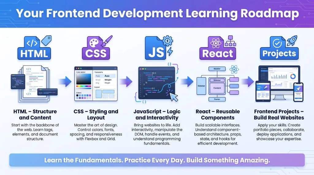
Use this 10-stage progression as your checklist:
| Stage | Topic to Learn | Practical Activity |
|---|---|---|
| 1 | HTML document structure | Create your first valid HTML5 page |
| 2 | Elements, links, lists, and attributes | Build a personal bio page |
| 3 | Semantic HTML and forms | Build an accessible contact page |
| 4 | CSS syntax, colors, and selectors | Style your bio page with an external stylesheet |
| 5 | Box model and typography | Design a clean profile or article card |
| 6 | Flexbox | Build a responsive navigation header |
| 7 | CSS Grid | Create a multi-column project gallery |
| 8 | Responsive design and media queries | Adapt your layout cleanly for mobile screens |
| 9 | Accessibility and DevTools debugging | Audit headings, contrast, and alt attributes |
| 10 | End-to-end capstone project | Launch a complete personal portfolio site |
Beginner Projects to Practice
You do not need to memorize every CSS property before building real things. Start with small, focused projects:
- Personal Profile Page: Showcase your bio, photo, skills list, and social links.
- Portfolio Website: Combine an introduction, project cards, education history, and a contact form.
- Product Landing Page: Practice hero sections, feature grids, pricing cards, and call-to-action buttons.
- Responsive Blog Layout: Arrange a sticky header, article cards, tags, and a responsive sidebar.
- Registration Form: Practice form labels, validation attributes, focus rings, and clean input alignment.
What Should You Learn After HTML and CSS?
Once you can build clean, responsive layouts comfortably, move on to JavaScript to add interactivity and application logic:
| Stage | Role in Frontend Development |
|---|---|
| HTML | Page structure, semantic meaning, and content |
| CSS | Visual styling, spacing, animations, and responsive layouts |
| JavaScript | Interactivity, DOM manipulation, events, and API calls |
| React or Next.js | Reusable UI components, routing, and scalable state management |
| Production Frontend | REST APIs, performance optimization, testing, and deployment |
When you are ready for the next step, read our JavaScript Fundamentals Beginner’s Guide and explore how frontend apps connect to backend services in our API & REST APIs Explained Guide. Remember: modern frameworks like React and Next.js do not replace HTML and CSS—they generate and organize them.
10. Frequently Asked Questions (FAQs)
1. What is the difference between HTML and CSS?
HTML defines the structure and content of a webpage (headings, paragraphs, images, links, forms), while CSS controls its appearance and layout (colors, fonts, spacing, alignment, and responsiveness).
2. Is HTML a programming language?
No. HTML is a markup language used to describe document structure. Unlike programming languages such as JavaScript or Python, HTML does not include variables, loops, conditionals, or functions.
3. Can I learn HTML and CSS without prior coding experience?
Yes. HTML and CSS are among the most approachable starting points in tech. You can write a few lines in a text editor, open the file in your browser, and see immediate visual feedback.
4. How long does it take to learn HTML and CSS?
Most beginners grasp core HTML tags and basic CSS styling within two to four weeks of consistent practice. Mastering responsive Grid/Flexbox layouts, specificity, and accessibility takes a few months of building real pages.
5. Which should I learn first, HTML or CSS?
Start with HTML, because CSS needs structured elements to style. Once you understand core tags and document structure, begin learning CSS right alongside HTML.
6. What is the CSS box model?
The CSS box model describes how every element’s dimensions are calculated from four layers: content, padding, border, and margin. Setting box-sizing: border-box makes width and height calculations much easier to predict.
7. What is the difference between Flexbox and CSS Grid?
Flexbox handles one-dimensional layouts (arranging items in a row or a column), whereas CSS Grid handles two-dimensional layouts (managing rows and columns simultaneously). Modern sites use both together.
8. Do I need JavaScript after learning HTML and CSS?
If your goal is frontend or full-stack web development, yes. HTML and CSS create static structure and styling, while JavaScript powers interactive menus, form workflows, state updates, and API data fetching.
9. Are HTML and CSS still relevant with React, Tailwind, and Next.js?
Absolutely. React components output HTML (via JSX), Tailwind CSS utilities map directly to CSS properties, and Next.js relies on semantic HTML and CSS layouts under the hood. Strong fundamentals make every framework easier to learn.
10. What tools should beginners use to practice HTML and CSS?
Start with Visual Studio Code (or any code editor) and Chrome or Firefox Developer Tools for inspecting live DOM and CSS rules. Online sandboxes like CodePen and JSFiddle are also great for rapid layout experiments.
Conclusion: Build a Strong Foundation in HTML and CSS
HTML and CSS sit at the heart of every website and web application. HTML provides clean, accessible meaning to your content, while CSS brings layout precision, visual polish, and multi-device responsiveness.
By mastering document structure, semantic tags, selectors, the box model, Flexbox, CSS Grid, and media queries, you build a durable foundation that carries directly into JavaScript, React, Next.js, and modern frontend engineering. Open your editor, build small layouts consistently, inspect everything in DevTools, and keep shipping.
Test Your HTML & CSS Knowledge
Put your frontend fundamentals to the test with these interactive quizzes on NeuraQuiz: